TABLEAU VISUALIZATION
Airbnb Data Visualization
An interactive Tableau project exploring Seattle Airbnb listings, pricing trends, and revenue patterns to uncover hosting insights and profitability drivers.
Project Overview
This project utilizes the Seattle Airbnb Open Data (2016) to visualize key metrics that affect hosting profitability. By processing thousands of listings, the analysis breaks down pricing strategies by location, seasonality, and property features.
The interactive dashboard allows potential hosts to investigate competitors, understand revenue peaks, and make data-driven decisions on where to invest.
Business Value
Identifying under-valued neighborhoods and optimal listing configurations to maximize ROI.
Timeframe
52-week comprehensive analysis of 2016 listings data.
Key Insights & Visualizations
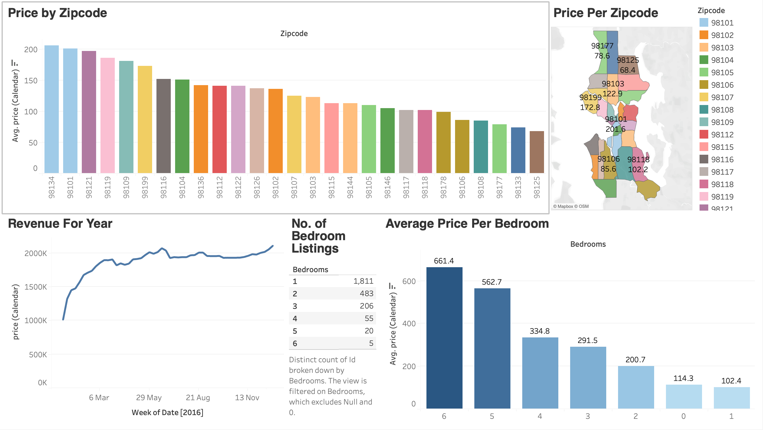
Geospatial Pricing Map
A geospatial heat map displaying average prices across different zip codes. The color intensity corresponds to price tiers, allowing users to instantly spot premium locations versus budget-friendly zones.
Price by Zip Code
A bar chart accompanying the map, showcasing the average price of listings for each zip code. Color-coded to match the map for seamless cross-referencing of premium neighborhoods.
Revenue Seasonality
A time-series analysis tracking pricing trends over 52 weeks. Identifies peak seasons (summer months/holidays) allowing hosts to optimize pricing strategies for maximum yield during high demand.
Bedroom Count Impact
Categorical analysis correlating number of bedrooms with listing price. Helps potential investors decide on property size by visualizing the price multiplier effect of additional rooms.
Interactive Dashboard
Explore local insights with filterable maps and charts.
Outcomes & Final Thoughts
This analysis successfully highlights the correlation between location, seasonality, and pricing. The dashboard serves as a powerful tool for hosts to benchmark their listings against the market. Future iterations could integrate sentiment analysis of reviews to see how guest satisfaction impacts price ceilings.